Simple and hands-on practice using Climate Data
In this post, I would like to show you how to create interactive climate maps using the Historical Climate Data, where you can visualize, examine, and explore the data. Data visualization plays an important role in representing data. Creating visualizations helps to present your analysis in an easier form of understanding. Especially when working with large datasets it is very easy to get lost, that’s when we can see the power of data visualization. In this exercise, we will work with climate data from Kaggle. We will build two interactive climate maps. The first one will be showing the climate change of each country, and the second one will be showing the temperature change over time. Let’s get started, we have a lot to do!
Table of Contents:
- Plotly
- Understanding the Data
- Data Cleaning
- Data Filtering
- Data Visualization
Kaggle is the world’s largest data science community with powerful tools and resources to help you achieve your data science goals.
Plotly
Plotly is Python graphing library makes interactive, publication-quality graphs. Examples of how to make line plots, scatter plots, area charts, bar charts, error bars, box plots, histograms, heatmaps, subplots, multiple-axes, polar charts, and bubble charts. It is also an open-source library.
To learn more about Plotly: Plotly Graphing Library
Understanding the Data
The Berkeley Earth Surface Temperature Study combines 1.6 billion temperature reports from 16 pre-existing archives. It is nicely packaged and allows for slicing into interesting subsets (for example by country). They publish the source data and the code for the transformations they applied.
Dataset can be found at the following link: Climate Data
The data folder includes the following datasets:
- Global Average Land Temperature by Country
- (GlobalLandTemperaturesByCountry.csv)
- Global Average Land Temperature by State
- (GlobalLandTemperaturesByState.csv)
- Global Land Temperatures By Major City
- (GlobalLandTemperaturesByMajorCity.csv)
- Global Land Temperatures By City
- (GlobalLandTemperaturesByCity.csv)
- Global Land and Ocean-and-Land Temperatures
- (GlobalTemperatures.csv)
We will be working with the “Global Average Land Temperature by Country” dataset, this data fits better for our goal because we are going to build interactive climate maps, and having a data filtered by country will make our life much easier.
Libraries
We will need three main libraries to get started. When we come to visualization I will ask you to import couple more sub-libraries, which are also know as library components. For now, we are going to import the following libraries:
import numpy as np
import pandas as pd
import plotly as py
If you don’t have these libraries, don’t worry. It is super easy to install them, as you can see below:
pip install numpy pandas plotly
Read Data
df = pd.read_csv("data/climate/GlobalLandTemperaturesByCountry.csv")
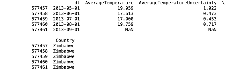
print(df.head())

print(df.tail())
df.isnull().sum()

Data Cleaning
Data Science is more about understanding the data, and data cleaning is very important part of this process. What makes the data more valuable depends on how much we can get from it. Preparing the data well will make your data analysis results more accurate.
Let’s start with cleaning process. Firstly, let’s start by dropping the “AverageTemperatureUncertainty” column, because we don’t need it.
df = df.drop("AverageTemperatureUncertainty", axis=1)
Then, let’s rename the column names to have a better look. As you can see above, we are using a method called rename. Isn’t that cool how easy to rename a column name.
df = df.rename(columns={'dt':'Date'})
df = df.rename(columns={'AverageTemperature':'AvTemp'})
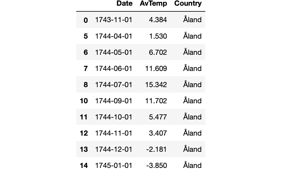
Lastly for data cleaning, let’s drop the rows with the null values so that they don’t effect our analysis. As we checked earlier, we have around 32000 rows with null values in AverageTemperature column. And in total we have around 577000 rows, so dropping them is not a big deal. But in some cases, there are couple other methods to handle null values.
df = df.dropna()
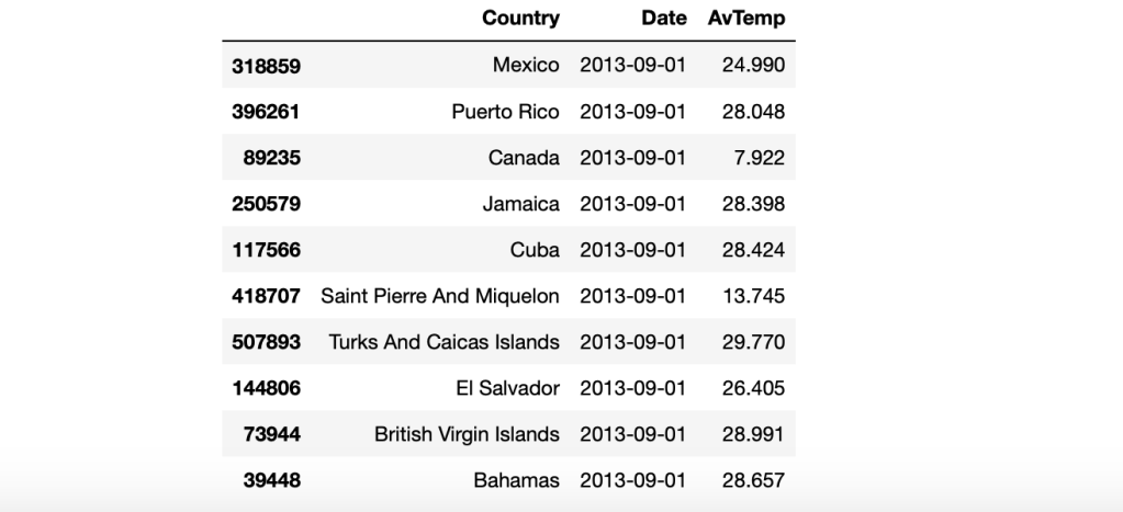
Now, let’s have a look at our dataframe. I will print the first 10 rows using head method.
df.head(10)
Data Filtering
This step is also data manipulation, where we filter the data so that we can focus on a specific analysis. Especially when working with big datasets, data filtering is a must. For example, our historical climate data is showing temperatures for all months between 1744 to 2013, so it’s actually a very wide range. Using data filtering techniques, we will focus on a smaller range like between 2000 to 2002.
Comparison Operators
- <
- >
- <=
- >=
- ==
- !=
We will use these operators to compare a specific value to values in the column. The result will be a series of booleans: True and Falses. True if the comparison is right, false if the comparison is not right.
Grouping by
In this step, we are grouping the dataframe by Country name and the date columns. And also, sorting the values by date from latest to earliest time.
df_countries = df.groupby(['Country', 'Date']).sum().reset_index().sort_values('Date', ascending=False)
Masking by the data range
start_date = '2000-01-01'
end_date = '2002-01-01'

mask = (df_countries['Date'] > start_date) & (df_countries['Date'] <= end_date)

df_countries = df_countries.loc[mask]

df_countries.head(10)
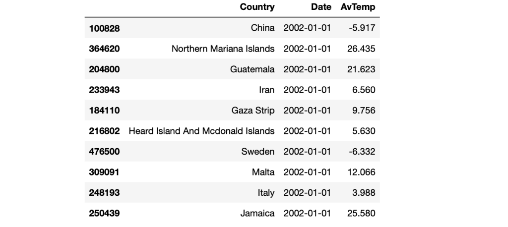
As you can see above, the dataframe is looking great. Sorted by date and filtered by country name. We can find the average temperature in each month of each country by looking at this dataframe. Here comes the fun part, which is data visualization. Are you ready?
Data Visualization
Components of Plotly
Before we start, as mentioned earlier there are couple sub-libraries to import to enjoy data visualization. These sub-libraries are also know as Components.
import plotly.express as px
import plotly.graph_objs as go
from plotly.subplots import make_subplots
from plotly.offline import download_plotlyjs, init_notebook_mode, plot, iplot
Climate Change Interactive Map
Perfect, now by running the following code you will see the magic happening.
fig = go.Figure(data=go.Choropleth(
locations = df_countries['Country'],
locationmode = 'country names',
z = df_countries['AvTemp'],
colorscale = 'Reds',
marker_line_color = 'black',
marker_line_width = 0.5,
))

fig.update_layout(
title_text = 'Climate Change',
title_x = 0.5,
geo=dict(
showframe = False,
showcoastlines = False,
projection_type = 'equirectangular'
)
)

fig.show()

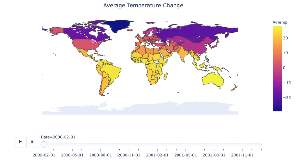
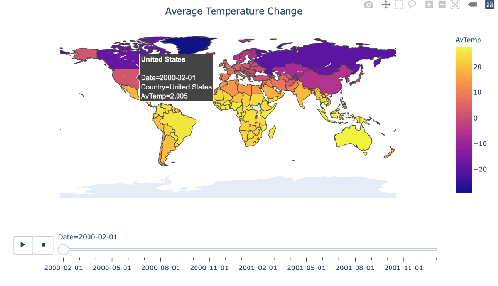
Climate change over time
#Manipulating the original dataframe
df_countrydate = df_countries.groupby(['Date','Country']).sum().reset_index()

#Creating the visualization
fig = px.choropleth(df_countrydate,
locations="Country",
locationmode = "country names",
color="AvTemp",
hover_name="Country",
animation_frame="Date"
)

fig.update_layout(
title_text = 'Average Temperature Change',
title_x = 0.5,
geo=dict(
showframe = False,
showcoastlines = False,
))

fig.show()